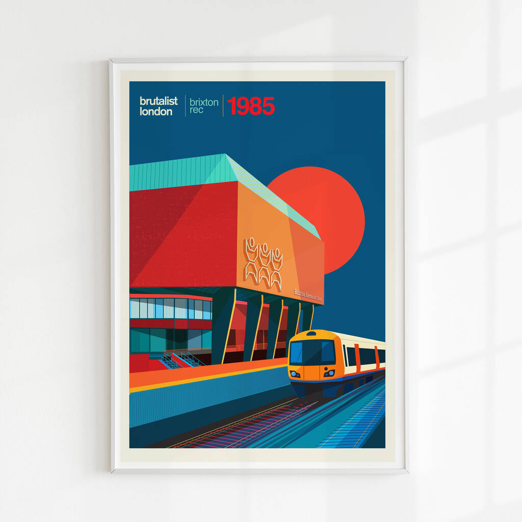
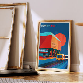
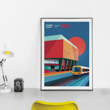
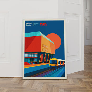
An illustrated artwork of the Brutalist Brixton Rec Centre in South London
Brixton Rec London Art Print, Brutalist London.
On the overground passing through Brixton you just cannot miss it! The logo, the icon, the bold font. Seems so stark, imposing or dystopian for a recreation centre, but just works. Designed by George Finch, this is the second building after the Lambeth Towers I had been keen to illustrate for a while.
Splashed it with colour...in the spirit of the vibrant multicultural diversity of Brixton that I've loved being a part of. I also chose the view as seen from the train, just because I love trains, stations, tracks and window seats! One of the lovliest ways to see London from a different angle.
The Brixton Recreation Centre stands as a beacon of architectural innovation and community empowerment. The construction programme began in 1974, and finally completed in 1985.
The exterior façade, characterised by sleek lines and geometric shapes, reflects a contemporary aesthetic that harmonises with the surrounding urban landscape. Beyond its architectural grandeur, the Brixton Recreation Centre serves as a vital hub for community engagement and social interaction. The interior spaces are meticulously designed to foster a sense of inclusivity and belonging, with versatile facilities catering to individuals of all ages and backgrounds.
Sustainability and Environmental Consciousness: In an era marked by growing environmental concerns, the Brixton Recreation Centre stands as a shining example of sustainable architecture and responsible design practices. From its energy-efficient building materials to its innovative waste management systems, every aspect of the center's design prioritises environmental sustainability.
I'm hardly the sporty kind. A few badminton sessions back in a the day, and now I'm a frequent visitor again for toddler soft play. That's the beauty- there is always something for everyone.
